Studio Shaft and the Head Tilt That Changed Anime
 By Mika Tanabe · Editor
One frame is often enough to identify a Shaft show. A character tips their head back at an angle that looks painful. Typography fills the screen and vanishes before you can finish it. A classroom has been reduced to two chairs against a single field of colour. Fans know the head tilt on sight, and it is easy to dismiss the whole style as a studio showing off. That misses where this visual grammar came from. Shaft found an answer to one of television animation's costliest problems: two people standing still while they talk. Over time, that practical answer became one of the few unmistakable authorial voices built by an anime studio. Puella Magi Madoka Magica is the clearest proof. Nisekoi supplies the strongest objection. The distance between those two Shaft productions explains both the power of the style and its limits.
Why a Conversation Costs So Much
Dialogue is where television anime budgets go to die. The characters barely move, the shot has little obvious energy, and the schedule still needs the scene to fill its allotted minutes. Most studios solve that problem by spending enough to make stillness look rich. ufotable uses compositing and camera work, so even a quiet exchange in Demon Slayer comes wrapped in light and depth. Kyoto Animation puts the money into acting, letting a face in Violet Evergarden carry a scene through microexpression alone. Both methods purchase fidelity, which means the expense never really goes away. Shaft chose a different currency. It spent on visual decisions instead of additional drawings. A hard cut lands on a beat. A text card delivers a thought faster than spoken dialogue could. A room becomes a plane of colour with one carefully chosen prop. Staircases lead nowhere, and corridors have no ceiling. Then there is the tilt, with a head thrown back so far that the image reads as a deliberate pose instead of a captured instant. This is theatre grammar fitted into a television production line. Shaft stages a conversation rather than filming one, and staging can create cinematography without demanding constant motion. The economy matters, but so does the result. Every missing wall and abrupt cut tells you that physical realism is not the scene's priority. Attention moves to the balance of power between the speakers and to whatever is happening inside their heads. A budget workaround becomes a point of view.
Bakemonogatari Shows the Full Vocabulary, With a Catch
Bakemonogatari puts that vocabulary through its full range. The supernatural cases mostly give two people a reason to talk one another into a corner. Shaft treats those verbal contests like another series might treat combat. Cuts arrive like parries. A background changes in the middle of a sentence to show who has gained the upper hand. A single word hits the screen at a scale that no line reading could equal. The effect is hypnotic, and the approach supported a sprawling franchise built on the idea that conversation alone can be appointment viewing. It is also the most favourable material Shaft could have received, which weakens it as proof of necessity. The source was already a talking series. Its prose was ornate, self-aware and delighted by digression. A highly stylised visual grammar was a natural match for writing made out of style. Bakemonogatari proves that Shaft speaks this language with remarkable fluency, but it cannot prove that the language contributes something the script did not already contain. The series and the studio are pulling in the same direction from the first scene. To see whether Shaft's methods can carry narrative information by themselves, you need a story in which the images understand something before the characters or dialogue will admit it. That is a harder test, and it arrives with an original production rather than an adaptation.
Madoka Makes the Style Part of the Story
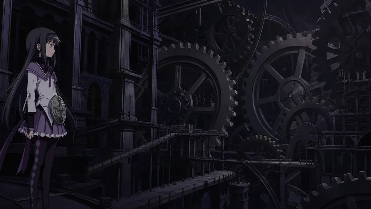
Puella Magi Madoka Magica is an original production. There is no manga or light novel, and no outside blueprint is available for the studio to hide behind. Akiyuki Shinbou directs. Ume Aoki's original character designs give the cast soft, round faces suited to a gentle after-school show. Yuki Kajiura provides the score. On one of the endings, she also writes the composition, arrangement and lyrics herself. The expected visual world breaks apart when the girls enter the witch spaces. The animation seems to change medium: cut paper gives way to collage, then scrapbook grotesque intrudes like footage borrowed from a different film. The show knows you can see the seams and has no interest in smoothing them over. That collision is the argument of Madoka, expressed visually well before any character can state it. The friendly surface and the hostile spaces cannot belong together, yet the girls must cross between them. This is why the first real turn feels like a trapdoor opening under the series instead of a clever twist added after the setup. The pictures have been warning you all along. Kyuubey performs the same trick on a smaller scale. The mascot is drawn to look adorable but animated in a way that feels wrong. Its face never blinks or changes, even while it offers you the deal of your life. A studio that simply filmed the conversations would lose that tell. Shaft's staging lets the audience register the danger before the script names it, so the style is carrying information the words deliberately withhold.
The Objection: Direction Reduced to Mannerism
The strongest criticism deserves a direct answer. The tilt can look like a tic. Text cards can imitate intellectual weight for no more than the price of a font. Empty, stylised rooms can be read as what a studio draws when it cannot afford a convincing room. Once a signature becomes this easy to recognise, direction risks hardening into branding. Viewers may end up applauding the studio logo while paying less attention to the scene. Nisekoi is the evidence. It applies the complete toolkit, including the cutting, typography and impossible interiors, to a stock love triangle. The outcome is exquisitely framed nothing. That charge is fair, and denying it would be fandom taking the place of criticism. It still identifies the limit of the tool rather than proving the tool itself false. Shaft's grammar is built to place a character's inner life on the screen. When the character has a rich interior, the images can reach feelings that dialogue cannot. When the plot runs on misunderstandings, those same images mostly decorate the mechanism. Nisekoi does not erase what Madoka achieves. It shows that a visual language cannot manufacture depth when the material gives it no depth to express. An amplifier still needs a signal. Shaft can make the amplification beautiful enough to distract from that absence, which is exactly why the criticism sticks. Beauty and purpose are not interchangeable, even when they use the same cuts and crooked necks.
March Comes in Like a Lion Proves the Range
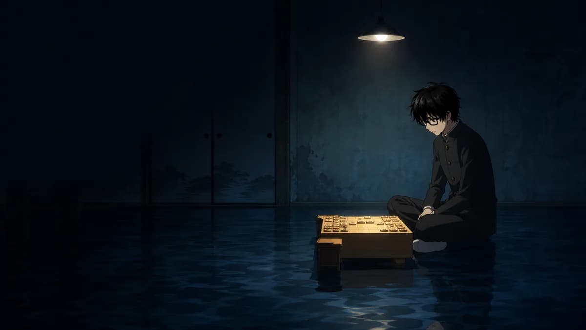
If Shaft's grammar only suited dread and irony, it would remain a genre gimmick. March Comes in Like a Lion answers that concern. The familiar devices return: backgrounds become voids, abstraction interrupts ordinary space, and water or weather floods a frame where a room should be. This time they are aimed at depression and family, along with the slow, unglamorous work of getting better. A boy's isolation appears as literal empty space surrounding him. A shogi match turns into psychic terrain instead of remaining two people seated at a board. That choice is accurate because the interesting part of shogi was never the board itself. The series does not wink at the viewer, and the images carry no ironic distance. Techniques that made Madoka's bright little town feel poisoned make the quiet shared meals in March Comes in Like a Lion feel like rescue. That ability separates a studio voice from a house trick. A trick repeats one effect. A language can express opposing experiences without losing its identity. Shaft has used the same visual vocabulary for a world whose sweetness conceals danger and for a home whose warmth helps someone survive. The forms are recognisable in both, but their emotional meaning changes with the people in the frame. That flexibility is stronger evidence than simple variety in subject matter. It shows that the studio understands why its devices work, rather than repeating them because audiences recognise the brand.
The Influence Hidden in Modern Anime
Look at the way anime cuts a conversation now. Typography becomes a punchline. Interiors collapse into blocks of colour. A hard smash cut sends the image into abstraction when a character's mind travels somewhere the physical room cannot follow. Shaft's dialect now appears across studios that share little else with it. Trigger sends title cards straight through some of the most physical animation of its era in Kill la Kill. Puella Magi Madoka Magica became a fixed point in its own right. It is routinely placed beside Neon Genesis Evangelion when people argue about the purpose of deconstruction, and it has stayed near the top of community rankings while newer, flashier series have come and gone. Even its broadcast history should have broken the effect. The final stretch was delayed after the earthquake and tsunami that struck Japan that spring. It later aired as a double bill, so the ending arrived weeks behind schedule and outside the intended rhythm. It landed anyway. Shaft also treated the broadcast as a gallery. Installments closed with guest illustrations by outside artists, with Ume Aoki receiving the last one. All of this returns to the famous head tilt. It was never really a joke about necks. It was Shaft's assertion that the choice of framing belongs to authorship. A conversation did not have to imitate a camera pointed at a plausible room. It could bend space around a thought, make a pose carry an argument, or replace physical action with graphic impact. Anime spent the following years absorbing that claim, often so thoroughly that the influence no longer announces its source.
FAQ
Shaft is known for a house grammar rather than one fixed visual look. Its signatures include head tilts, flashing typography, hard cuts and sparse, stylised architecture, much of it developed under director Akiyuki Shinbou. The main calling cards are the Monogatari series, beginning with Bakemonogatari, and Puella Magi Madoka Magica.